The launch widget is a direct way for your users to experience relevant product tours. It’s in the form of a UI element that can be displayed on your web pages.
You can use the launch widget as a collection of helper tours, covering the important areas for your end-users.
Good use of a launched widget would be to show users a few onboarding tours in order to get them set up and using your application.
How end-users interact with the launch widget
The users will simply open this widget, search for the appropriate tour and launch it manually.
Toggling the Launch Widget visibility on your website
The launch widget’s visibility can be toggled on or off. This is an optional UI feature that you can enable or disable as you see fit. The default visibility state is “on”.
The visibility can be toggled from:
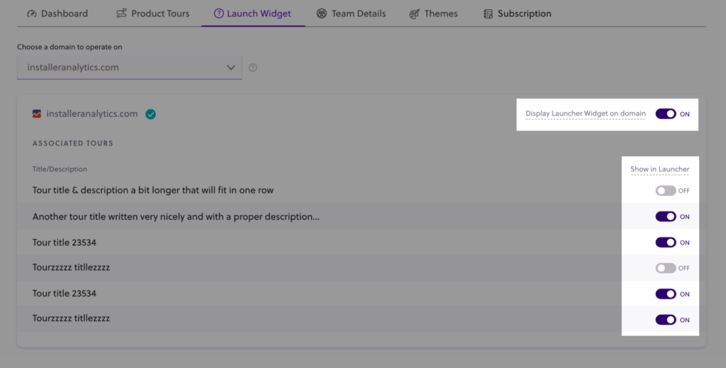
- The Launch Widget tab – use the top-right toggle to enable or disable the widget
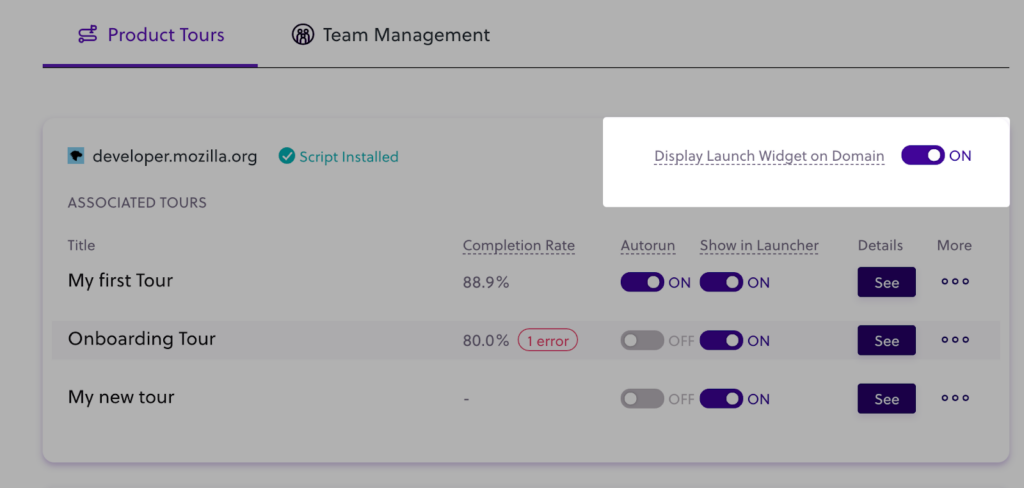
- The Product tour tab – use the top-right toggle within a specific domain to enable/disable the widget


The minimum requirement for the visibility
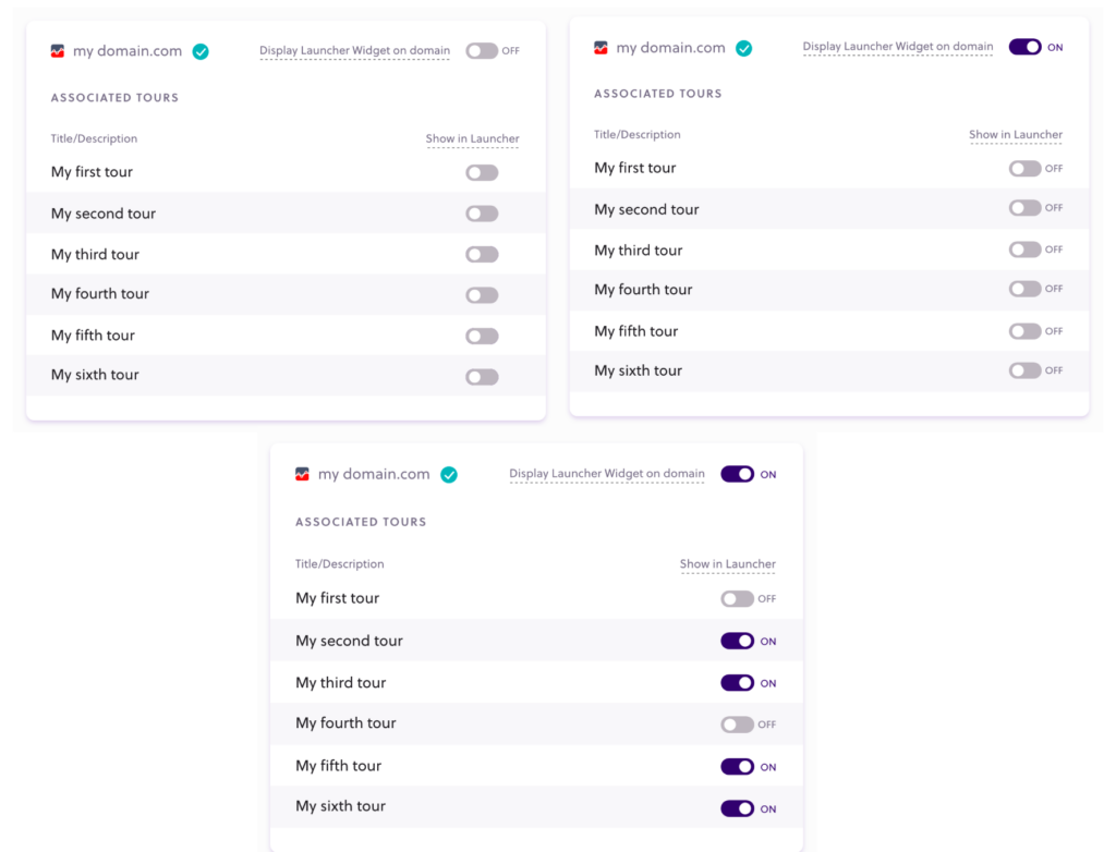
Even if you have the launch widget turned on, you must have at least one visible product tour in order to have the widget displayed on a domain.
Example: The launch widget is live and visible on “my domain.com” only in the third picture since only in that case, you also have tours toggled to appear in it. In that case, the widget will appear, and it will contain the 4 live tours.
