Themes can be created by any member of the team. Once created, anyone from the team can use them.
Creating a new theme
To create a new theme, go to the Themes tab, and then press the Create a theme button.

To edit a theme, click the Edit button next to the theme’s name, in the overview of the themes.
Live theme editor
The live editor is used to create and edit themes. You can choose custom colors for different elements and preview them in real time.
The color style customization is split in two categories:
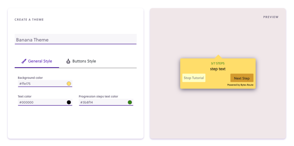
General style
These are the main colors of a theme.
- background-color =the background panel of the tour window.
- step text color =the color for the step text description
- progression steps text color =the color for the progression text (e.g. 3/7) located at the top.
Buttons style
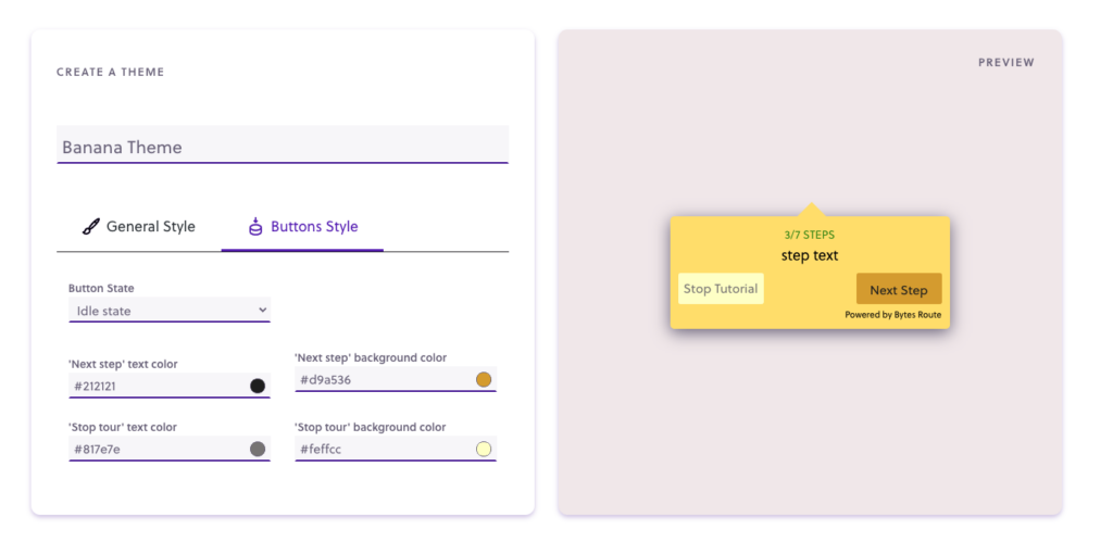
This style customization category includes the colors of the navigation buttons.
- next step text color =the text color of the text ‘Next step’
- next step background color =the background color for the ‘Next step’ button
- stop tour text =the text color of the text ‘Stop tour’
- stop tour background color =the background color for the ‘Stop tour’ button
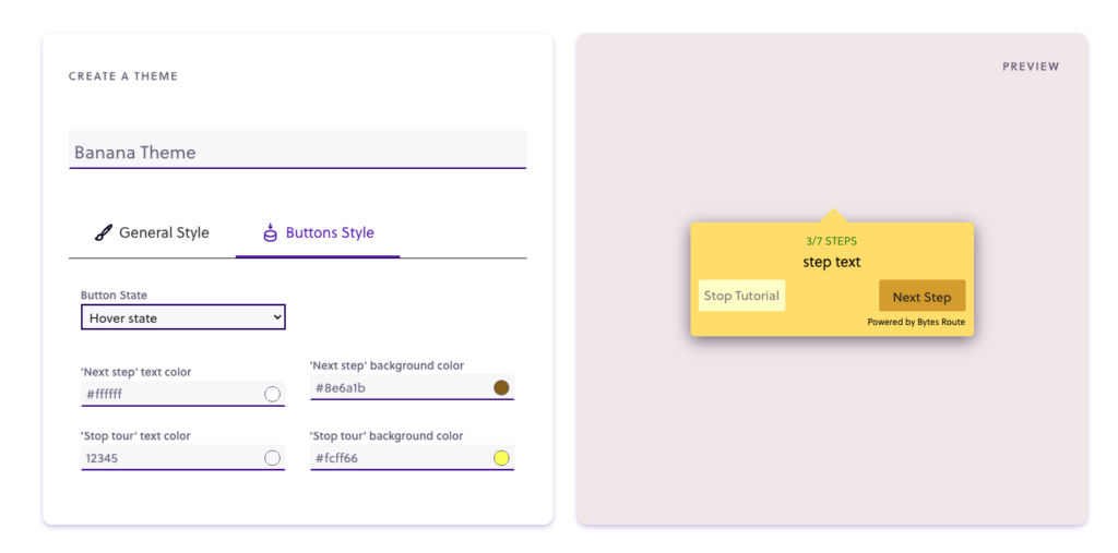
There are 2 states you can customize, idle and hover. They can be switched from the Button State dropdown.
Buttons idle style
From this menu, you can choose how the buttons will look in their default state.
Buttons hover style
From this menu, you can choose how the buttons will look when users hover their cursor over them.
Note: editing the hover style is optional. If you don’t provide any custom colors, the system will automatically choose an appropriate hover color based on the colors you chose for the idle state.
Color picker
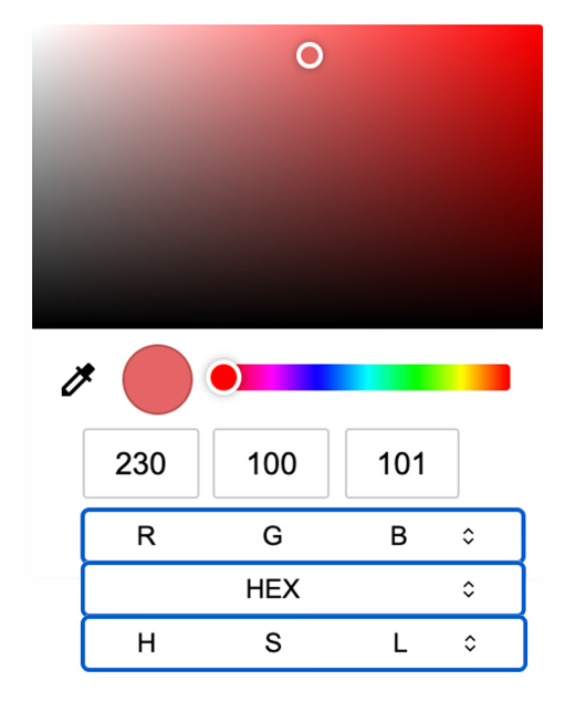
To pick a custom color, click the current color of any element. Colors are displayed in HEX, but color values can be chosen from these color models: HEX, HSL, and RGB.
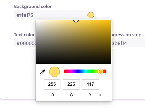
Switching color modes
To switch the color input mode, click the RGB/HEX/HSL words.
Applying a theme
A theme can be applied on a tour, during the creation or editing phase, from the Tour Finalization pop-up.
The list of themes from the dropdown list will be updated based on the selected Team. Remember that each team has its own set of themes.
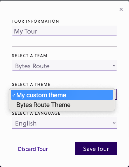
The theme of a tour can also be applied from the tour options page.